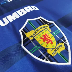
Patterns
The design of the Scotland football jersey is a fascinating trip through patterns, colours, emblems, fonts, and images that reflect the country’s rich cultural heritage and changing fashion trends. Since its inception in the late nineteenth century, the Scotland jersey has experienced various modifications, each symbolising a distinct period in its history. The early jerseys were distinguished by their plain dark blue colour, a simple yet effective choice that represented the national flag, the Saltire. This solid colour not only symbolised the team’s identity, but it also promoted solidarity and pride among both players and supporters. As the decades passed, the design evolved to include more elaborate motifs.
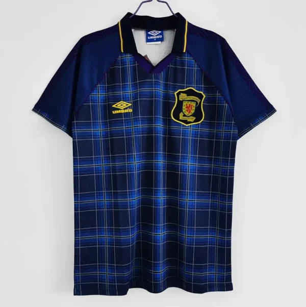
The tartan pattern, introduced in the 1980s, was one of the most significant developments. Tartan, a famous symbol of Scottish culture, first featured softly on the 1986 World Cup jerseys. The integration of tartan into the football jersey was a masterstroke, flawlessly integrating national heritage with modern sports flair. The tartan theme has reappeared in a variety of shapes over the years, from dramatic, all-over designs to more modest accents, ensuring that each iteration remains fresh while yet being unmistakably Scottish.
Colors
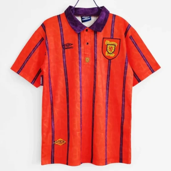
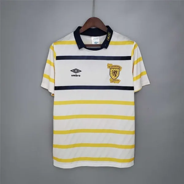
Colours have played an important influence in the creation of the Scottish football uniform. While dark blue has remained the major colour, representing history and continuity, secondary colours have been employed to provide diversity and modernity. White and red are widely used as complementing colours in trim details on collars, cuffs, and shorts. These accents not only improve the jersey’s visual appeal, but also create a stark contrast that showcases the dark blue. Alternative colour schemes, such as light blue and even yellow, have been used on occasion, especially in away kits. These experiments demonstrate a willingness to develop while remaining true to the team’s typical palette.
Logos & Fonts
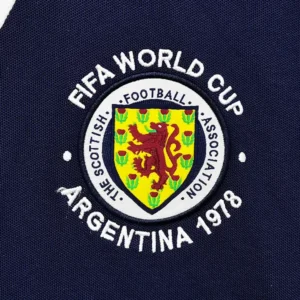
Logos and crests are crucial to the identity of any football jersey, including the Scotland jersey. The lion rampant, inspired by the Royal Banner of Scotland, has been a significant fixture on the jersey. This emblem conveys pride and strength, which resonates well with the Scottish identity. Over time, the crest has undergone slight improvements, modernising its design while retaining its distinctive symbolism. In addition to the national insignia, the use of brand logos, particularly those from kit manufacturers, has become standard. These trademarks, which are frequently placed on the breast opposite the national crest, represent the collaboration between the national team and sportswear firms, representing both tradition and modern business reality.
Graphics
Fonts and graphics on Scotland’s football jerseys have also altered tremendously. Early jerseys had little lettering, usually just plain block letters for player numbers. Fonts became more sophisticated as design technology evolved. Modern jerseys frequently incorporate bespoke typefaces that complement the overall design of the kit. These fonts are intended to be both beautiful and legible, so that player names and numbers can be easily distinguished during matches. Graphics have also gained popularity, with subtle watermarks, embossed patterns, and dynamic graphics adding depth and texture to the jerseys. These aspects not only improve the visual attractiveness of the kit, but also add to its usefulness by boosting breathability and comfort using revolutionary fabric technologies.


